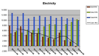
Here is the graph, (you know I love a good graph) that depicts our electricity consumption for the past quarter. Brown for Grid (100% Green power Wind), Green for clean Solar PV, and Blue for total kWh utilised. The Y-axis represents the daily average usage for the specific week. The black trend line is a 2 point moving average based on grid usage, with a noticeable downward trend. Click on the image to enlarge.
 As you can see, this week the green solar bar is higher than the total, with the grid power in negative. That means that I exported more power to the grid than I used in the house. This is the first week this year that we have made more power than we have drawn from the grid, which was 2.4 kWh excess to be exact. I hope the neighbours enjoyed the extra clean power even though they probably didn’t pay for it!
It gives me a warm fuzzy feeling to watch the electricity meter spin backwards on a sunny day. It makes it all seem worthwhile even with a travesty of a feed-in tariff in this state. Greening in action!

oh yeah, gotta love a graph, especially one derived from such a satisfying source. onya GoG’s. i cant wait until we get our meters up and running.
Good on you,to all the members of GoG house.
Now Gavin, using the rough asumpyion that my new fehicle will have about a third of embodied energy of a normal car, the fact that I will be making my own electricity to charge batteries, phones and the like, how will I map my carbon footprint whilst on tour ??????
ps will ring you when I get back from 50km ride tomorrow
You really are an inspiration, Gavin.
humph
How can anyone love graphs?
After such a disparaging comment…well done with lectricity’ usage. It takes a real effort to see the line go south.
Lisa x